Redesigned starter kits with dark mode, layouts, and typed forms

We have shipped a big update to all five official starter kits: hypermedia, inertia-react, inertia-vue, api, and api-monorepo.
The three web kits get a complete visual redesign, dark mode, type-safe forms, and better auth defaults. All five kits, including the API kits, now use the latest versions of their dependencies.
Let's go through the changes one by one.
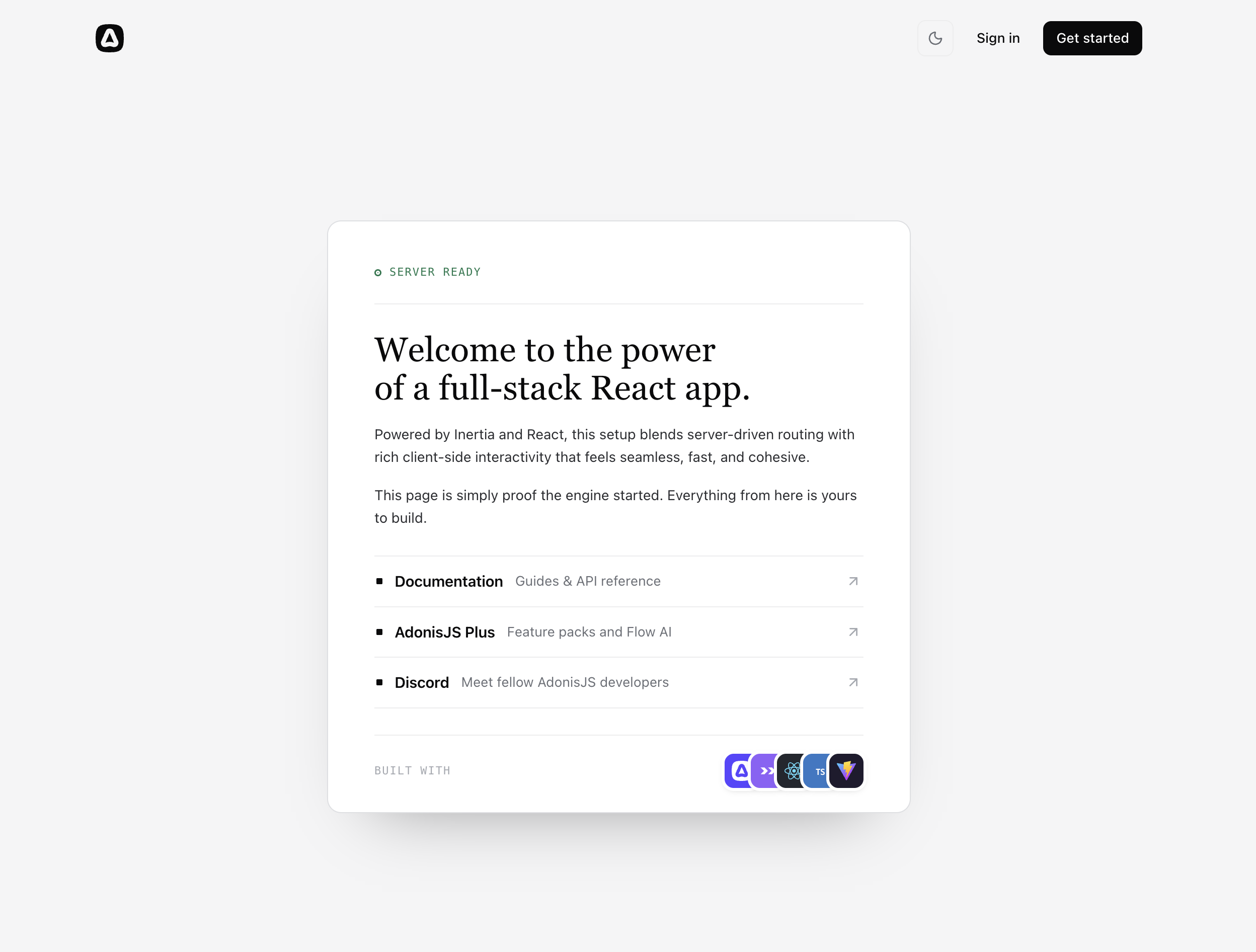
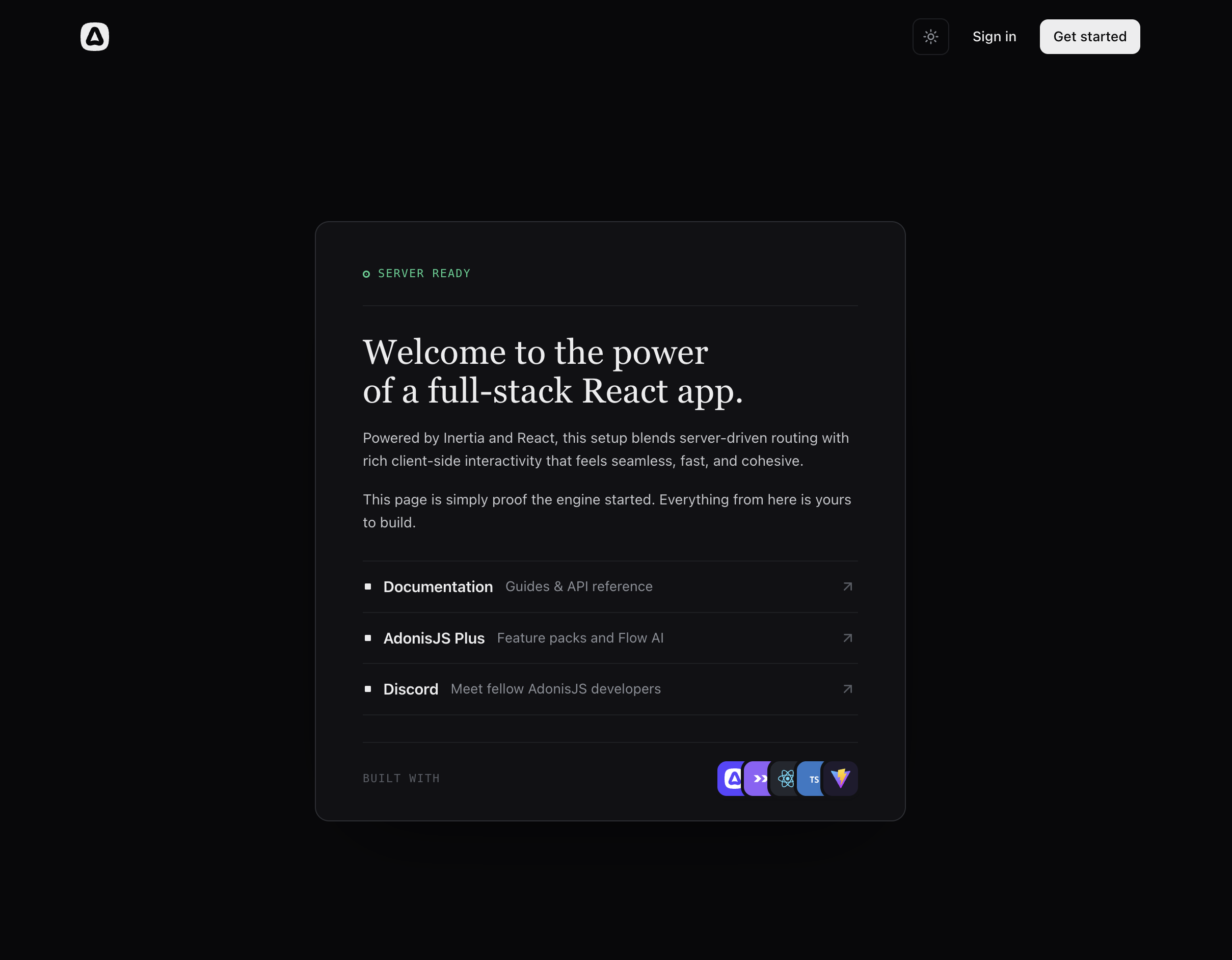
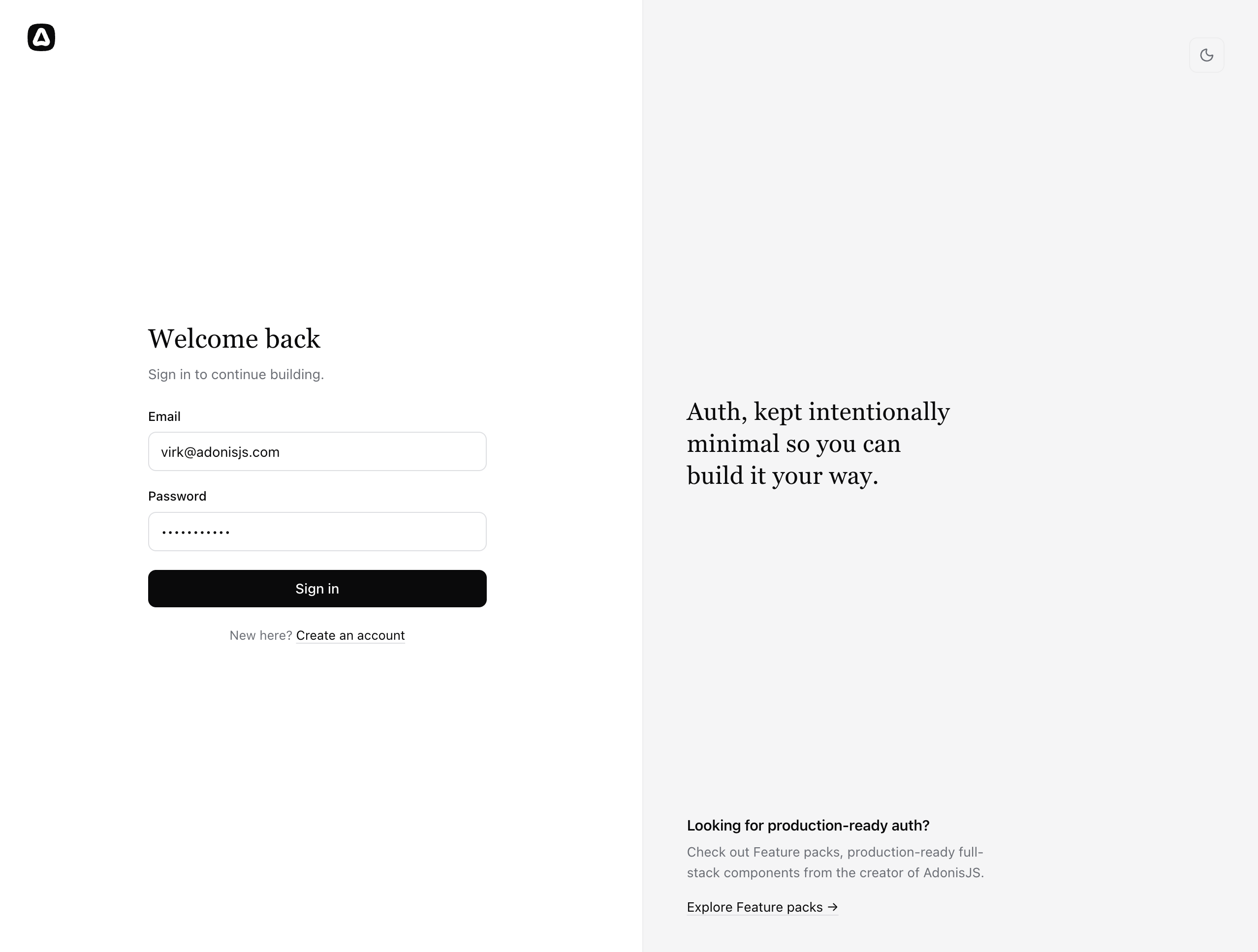
A new design, built to be re-themed
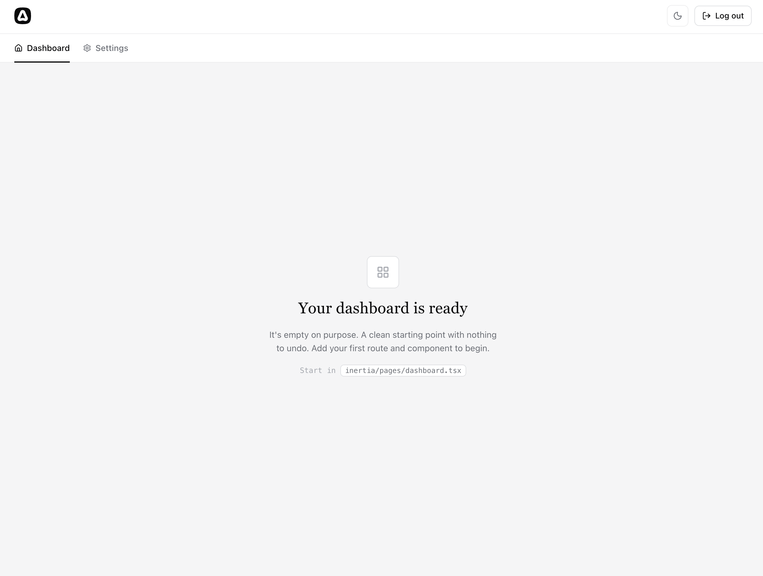
The web kits no longer ship a single bare-bones page. Every screen (landing, login, signup, error pages, and a new dashboard) has been redesigned on top of a small, hand-written CSS design system.
There is no CSS framework involved. The design is defined using a handful of semantic tokens (--paper, --ink, --line, --btn, and so on) declared in one place at the top of the app.css file. If you want to re-theme a kit, that is the file to edit.
Dark mode
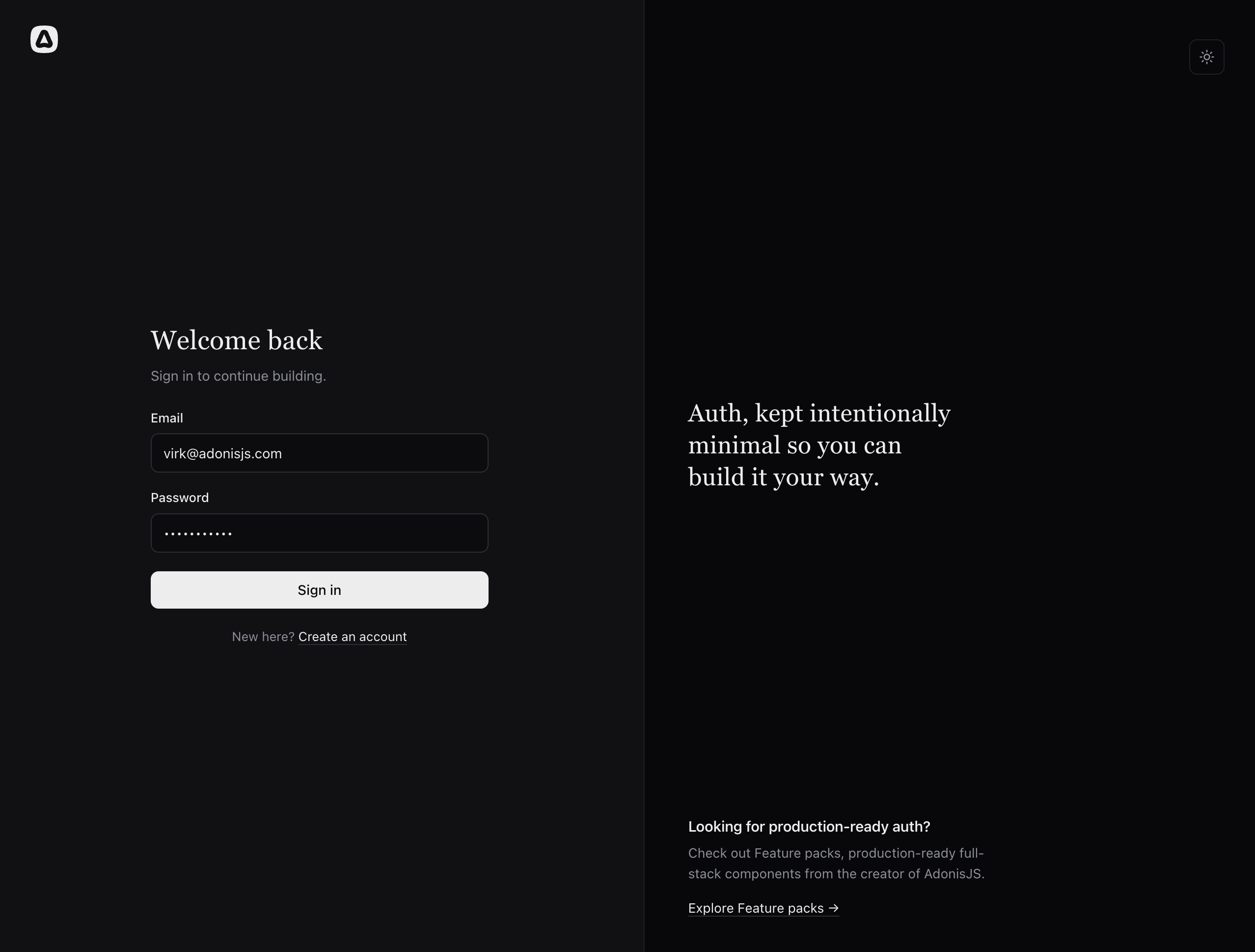
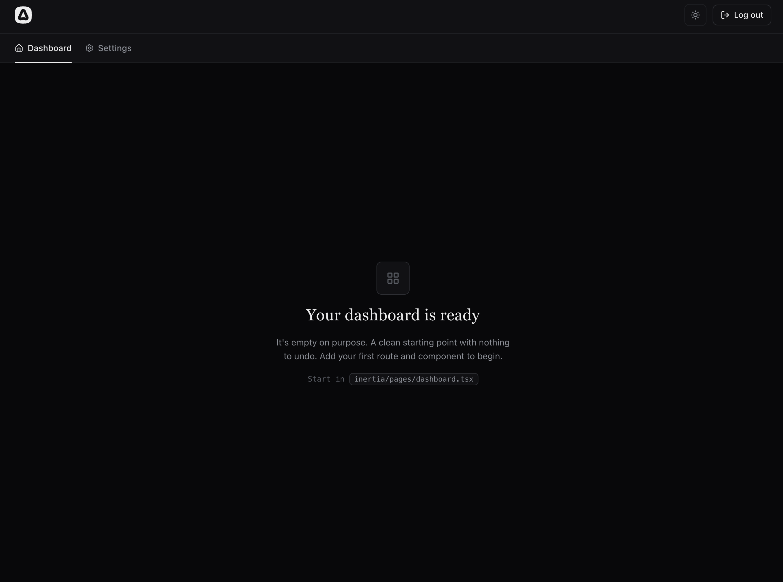
All three web kits support light and dark themes out of the box.
The theme is a deliberate user choice and not just a media query. A toggle in the header flips it, a cookie remembers it, and the server renders the correct theme into the HTML. As a result, there is no flash of the wrong theme on the first paint, even with SSR.
Purpose-built layouts instead of one generic shell
Earlier, the kits shipped a single shared layout. It is gone. In its place, each kit ships four layouts that mirror how real apps are structured.
- Marketing: Public pages, with a floating header that adapts to the auth state.
- Auth: A focused two-column shell for login and signup.
- App: The authenticated area, with a top bar, navigation built from a list of links, and logout.
- Settings: A sidebar of links and a panel for the current page, ready for your own settings pages. It nests inside the app layout.
The marketing and app layouts share a single header component, rendered either as a floating header or as a full-width bar.
In the hypermedia kit, layouts live under resources/views/components/layouts and are used as @layouts.app(...).
In the Inertia kits, layouts are attached per page instead of being injected globally. A page declares its layouts as an array, so opting out of a layout, adding one, or nesting them is a one-line change.
Dashboard.layout = [AppLayout]
Profile.layout = [AppLayout, SettingsLayout]
Finally, every web kit has a new authenticated /dashboard route. It is intentionally an empty state. After login or signup, you land somewhere real, with a pointer to the exact file to start building in.
Building blocks for your own pages
The kits do not ship pages you would delete on day one. Instead, they ship the pieces you need to build your own.
- Page renders a page heading, an optional description, and actions.
- Section groups content under a title.
- NavLink marks the current route with
aria-currentand matches nested URLs by default.
Each kit's README walks you through adding a new page and a new settings area using these components.
Fully typed forms
The Inertia kits now run on
@adonisjs/inertia v5
along with Inertia v3.
The highlight here is the Form component, which understands your routes end to end. Point it at a route using <Form route="session.store">, and the form's errors object is typed from that route's Vine validator. errors.email autocompletes, and a typo in a field name is a compile error. This works in both React and Vue.
Better auth defaults
- Login input is validated. The session controller runs a
loginValidatorbefore checking credentials, so users get proper field-level error messages instead of a generic failure. - Password confirmation has its own field. The signup validator declares
passwordConfirmationexplicitly usingsameAs('password'). Confirmation mismatches now show up on the confirmation field, where users expect them. - The auth pages also picked up the small things that matter: correct
autocompleteattributes,aria-invalidstates, and pending states on submit buttons.
Icons, toasts, and polish
The kits use
Lucide
icons throughout. The Inertia kits use lucide-react and lucide-vue-next, and the hypermedia kit uses edge-iconify with the @svg('lucide:…') tag.
Flash messages are rendered using custom-styled toasts that match the design system in both themes. In the Inertia kits, they travel in the dedicated flash field of the page object (read using usePage().flash) instead of props, so they never reappear when navigating back.
The 404 and 500 error pages are designed pages now, instead of placeholder headings.
Latest everything
All five kits, including the API kits (which are otherwise unchanged), now target the latest versions of the ecosystem: Vite 8.3, Inertia 3.7, ESLint 10.11, better-sqlite3 13, React 19.3 / Vue 3.5.43, @adonisjs/vite 6, and @adonisjs/inertia 5. TypeScript stays on v6 for now.
The fastest way to see everything in action is to create a new project.
npm init adonisjs@latest -- --kit=react